 To the left is a photo of myself researching album covers that we could take inspiration from for our digipak design. We all took time to research different ideas that we had and then in our meetings we would share what we had found and find a way to incorporate our ideas.
Front and Back Digipak

Front and Back Digipak
Inside Digipak

Inside Digipak

Please click this image to enter out site
Sunday, 30 October 2016
R+P Post 33: Reflections on my role and contribution during research and planning
During the research and planning stage of creating our music video, I played an active role in all the tasks that we divided between our group. My main jobs were to create the shoot-board for both the rough shoot and real shoot in the studio and to act in the rough shoot narrative which took place on October 24th in Finsbury Park. Along with this, we all attended meetings with each other to track our progress throughout and allocate new roles each week.
 To the left is a photo of myself researching album covers that we could take inspiration from for our digipak design. We all took time to research different ideas that we had and then in our meetings we would share what we had found and find a way to incorporate our ideas.
To the left is a photo of myself researching album covers that we could take inspiration from for our digipak design. We all took time to research different ideas that we had and then in our meetings we would share what we had found and find a way to incorporate our ideas.
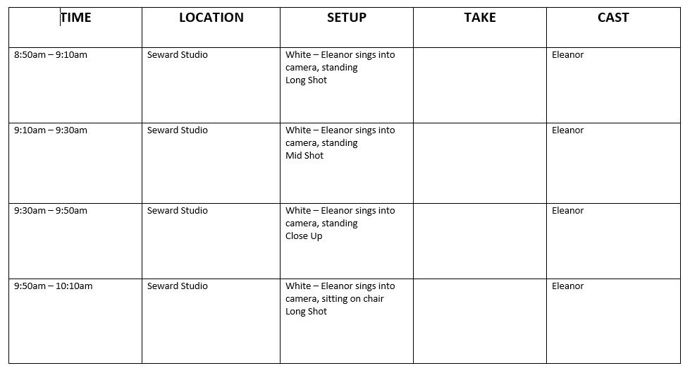
R+P Post 32: Test shoot and rough edit
The media department created a test shoot schedule catered for the three A2 media groups, based on when we have free periods and breaks/lunches. In the table below, we are in Group 1 which is coloured white.


From looking at this schedule, we thought we had lots of time to test all the shots and set ups that we wanted, however, we soon realised that lighting takes a lot longer than expected. It involved selecting all the lights we wanted and changing their colours so that the performer was illuminated perfectly.
From the rough shoot for both studio and narrative we discovered some things that needed to be worked on such as:
- More energy in the studio shots in terms of performance
- A range of studio shots (e.g. dolly shots)
- More clips for the narrative section
- A clearer storyline in the narrative section
- Improve continuity at the beginning
We then conducted some audience and teacher feedback and they agreed with the above points as well as adding further improvements:
- Make the studio shots more elaborate and exciting
- Tighter framing
- Could use a split screen for the narrative to make the storyline clearer
- Fast pace editing to engage audience more
Rough Cut can be seen above
R+P Post 31: My call sheet
Call sheets are essential for all the cast and crew as it holds the vital information for when everyone is expected to be on set, as well as showing when breaks will be taken. It is an important document that helps the shooting days run smoothly and must be followed strictly by everyone involved.

To the right is a page of the call sheet for Monday's test shoot in the studio

To the left is a page of the call sheet for Monday's real shoot in the studio


To the right is a page of the call sheet for Monday's test shoot in the studio

To the left is a page of the call sheet for Monday's real shoot in the studio

To the right is a page of the call sheet for the narrative - same for the rough shoot and real shoot
R+P Post 30: My shoot-board
We created a shoot-board for both the rough shoot and the real shoot in order to make it easy to take all the shots we need and in what order to take them. The order of taking the shot is important because it means that despite the shots not appearing in that order when we edit the clips, we can get all the shots we need for a particular set up and makes use of time more efficient.

To the right is a page from the shoot-board for the rough shoot in the studio

To the left is a page from the shoot-board for the real shoot in the studio

To the right is a page from the shoot-board for the narrative - it is the same for the both the rough shoot and real shoot

To the right is a page from the shoot-board for the rough shoot in the studio
To the left is a page from the shoot-board for the real shoot in the studio

To the right is a page from the shoot-board for the narrative - it is the same for the both the rough shoot and real shoot
R+P Post 29: Rehearsals
The aim of rehearsals is to make sure that the people acting in our music video have practiced the lyrics and feel comfortable in front of the camera. This means that when we come to the main shoot, everyone will be prepared and wont be camera shy!
The test shoot will act as our main rehearsal time as we can try out some shots and the actors will be lip syncing in the studio for the first time. As well as this, we will experiment with the different set ups we want, involving lots of coloured lighting. We also asked the actors to learn the lyrics in their spare time and then filmed Eleanor lip syncing to see how her private rehearsals were going. The video can be seen below.
After watching the video we realised that she needs to work on facial expressions to accentuate the lyrics that she is singing and could also incorporate some body movement, but ultimately, the lip sync works really well and she has learnt all the lyrics word for word so she is set for the real shoot.
R+P Post 28: My kit list
We created a kit list with the all the essential equipment that we would need for our location shoot which is shown in the image below.


We didn't include a tripod in the kit list because we decided that all of the location shots would be hand held camera shot in order to add to the gritty, urban feel of our video and to reflect the normality of the story which occurs in everyday life.
The list is also limited as it is only for the location shoot, whereas in the studio, we will use a lot more kit including; a lighting desk and flash/spotlights.
The benefit of creating a kit list prior to our shoot is mainly so that we can check we have it all to begin with and that we have it all when packing up. Using this kit for the rough shoot will help us practice our skills so that we can frame our shots and be more time efficient in the real shoot as we will already know how everything works.
Friday, 21 October 2016
R+P Post 27: Casting
When casting people for our video, we had to choose people that we knew we could rely on and so wanting to utilise people in our group. However, because our group is only made up girls, we had to extend beyond this and pick a boy who's style fitted the artist's and music video's theme. We came up with a casting table which includes some of the qualities of the performers.


This table will be given to each of the cast members so that they gain an understanding of their role and be able to delve into the mindsets of each person prior to filming, so that when we do film, they will have figured out how to act.
R+P Post 26: Set design, locations and props
For our set design and colour set ups, we had to find props that matched each colour, so for white, blue and pink. We decided on props that held different amounts of meaning and significance.

 The colour boxes will be used to create a nice glow lighting effect as well as for the performers to sit on for a variety of shots. The silver balloons are commonly associated with parties and celebrations so we will use them to connote the artist's freedom from restrictions.

 The petals portray breaking free from ideal expectations (such as beauty ideals because flowers are often described as 'pretty), whilst the lollipops are visual representation of the lyrics "So you say I'm not sweet enough, but I still got sugar."
Our narrative location is a place in London called Finsbury Park because it is very urban and has lots of back streets and gritty tunnels that we can use. It is also always busy which helps create the sense that the girl is in a busy towns with endless possibilities, whilst it makes it harder for the boy to find her and allows for his frantic energy. It is also near Alexandra Palace which is another loaction that we use because it has a view of London landmarks and is very scenic. This is the end loaction where the girl and boy make up and although it still appears gritty, the view gives it a romantic feel.

 The colour boxes will be used to create a nice glow lighting effect as well as for the performers to sit on for a variety of shots. The silver balloons are commonly associated with parties and celebrations so we will use them to connote the artist's freedom from restrictions.
 The petals portray breaking free from ideal expectations (such as beauty ideals because flowers are often described as 'pretty), whilst the lollipops are visual representation of the lyrics "So you say I'm not sweet enough, but I still got sugar."
 |
| Finsbury Park and Alexandra Palace |
R+P Post 25: Costumes, props and make-up
In order to come up with ideas for costumes, props and make-up, we had to first figure out what kind of studio set up we wanted. We decided that we wanted to have different colour set ups, including white, blue and pink. We were inspired by Destiny's Child music video for 'Say My Name' which also uses different colour set ups as seen below.

 The studio costumes are just items of clothing that match the particular colour set up, e.g. blue dress for the girl and blue jeans for the boy. The narrative costume for the girl is something we thought is outgoing and bold, and the for the boy its just everyday clothing to reflect the normality of life. However, after doing the test shoot we discovered it isn't practical to wear these clothes in the winter as it is too cold and so the costume will consist of jeans instead of a skirt, but will still include a vibrant top.


We then needed to decide which clothes we wanted the male and female in the studio to wear to fit these colour set ups. Below is a section of the list we came up with.
 The studio costumes are just items of clothing that match the particular colour set up, e.g. blue dress for the girl and blue jeans for the boy. The narrative costume for the girl is something we thought is outgoing and bold, and the for the boy its just everyday clothing to reflect the normality of life. However, after doing the test shoot we discovered it isn't practical to wear these clothes in the winter as it is too cold and so the costume will consist of jeans instead of a skirt, but will still include a vibrant top.
Below is the outfit in the test shoot that was unpractical
Below are the blue and pink outfits to match the set ups in our test shoot


After discussing costumes we had to decide what kind of make-up we want the female in the studio to wear as well as the female in the narrative. We felt it would be best to give them both bold, statement eye make-up as the whole video is about being yourself and breaking barriers. We want to create a similar style for the studio and narrative to draw comparisons between the two and really emphasise that the lip sync in the studio tells the story of the narrative. A member of the group, Eleanor, experimented with different eye looks.
R+P Post 24: Planning my digipak panels
Our digipak panels are a way of showing who our duo are: what their style is and what they want to promote. We want to have a close up image of the their faces on the front with minimal make up in order to portray them as open individuals who are relatable to everyone. However, on the back we want to have a photo of them where they are wearing cool branded clothes, surrounded by lights. The lights image is a reoccurring motif that we have throughout our project as its shows vibrancy and life, something which is vital to our artist image. The branded clothes allow for the album to be more specific to our target audience, as we looked into what brands 16-25 year olds are wearing currently.

One of the album we covers we looked at is FKA Twigs album 'LP1' as it is a close up of her face and gave us inspiration for the type of shot we could take. However, in this photo she is wearing lots of make up, but this actually face us ideas for the type of hair and make-up looks we could for Mira's promo shots.
 To the left is AlunaGeorge's promo shot and they are clearly really close as seen by their silly poses so on our digipak we want to recreate this and shot our duo MiraJax to be close as well. We will show their closeness by taking photos of them together and experimenting with poses such as Jack having his arm around Mira.

We also had to think about what we wanted on the inside panels but we knew we wanted something related to lights. Pru, a member of our group, suggested that we take shots at 'God's own Junkyard' which we could then also use for our website.


One of the album we covers we looked at is FKA Twigs album 'LP1' as it is a close up of her face and gave us inspiration for the type of shot we could take. However, in this photo she is wearing lots of make up, but this actually face us ideas for the type of hair and make-up looks we could for Mira's promo shots.


We also had to think about what we wanted on the inside panels but we knew we wanted something related to lights. Pru, a member of our group, suggested that we take shots at 'God's own Junkyard' which we could then also use for our website.

Above is the template for our digipak design
R+P Post 23: Planning my web pages
The website is an important part of linking our media platforms together as it allows for videos to be watched, photos to be viewed and social media pages to be accessed. We will show synergy through the use of the same font on both the website and album cover. Also, we will have the reoccurring motif of lights and bright colours throughout everything that we make.

When thinking about what website design we wanted, we sketched out a rough idea of the layout on an A4 piece of paper which can be seen on the right. In order for us to have lots of images we could use, we needed to schedule a date to take the promo shots, which would include a variety of outfits, make-up and hair styles.
We researched some websites which consisted of the same scroll layout that we wanted, rather than lots of different pages. During this research we found out that AlunaGeorge's website, along with Rae Sremmurd's, both use the layout we wanted and so we took ideas from both of these in order to make ours retain the same professional quality.

A main feature that we wanted to include, taking inspiration from AlunaGeorge's website, was a landing page that showed the artist's style and had buttons to take the viewer through several photos, one of which would be a promotion for the album.

Another feature we wanted our website to include was a list of the tour dates, taking inspiration from Rae Sremmurd's website, and using a live ticketmaster link to redirect the viewer to a page to buy tickets for the tour.
Ultimately, we want to create a visually interesting website that will engage our audience and allow for them to get involved by buying tickets and merchandise. We want them to feel like they have opportunities to follow our artist and keep them excited.

When thinking about what website design we wanted, we sketched out a rough idea of the layout on an A4 piece of paper which can be seen on the right. In order for us to have lots of images we could use, we needed to schedule a date to take the promo shots, which would include a variety of outfits, make-up and hair styles.
We researched some websites which consisted of the same scroll layout that we wanted, rather than lots of different pages. During this research we found out that AlunaGeorge's website, along with Rae Sremmurd's, both use the layout we wanted and so we took ideas from both of these in order to make ours retain the same professional quality.

A main feature that we wanted to include, taking inspiration from AlunaGeorge's website, was a landing page that showed the artist's style and had buttons to take the viewer through several photos, one of which would be a promotion for the album.

Ultimately, we want to create a visually interesting website that will engage our audience and allow for them to get involved by buying tickets and merchandise. We want them to feel like they have opportunities to follow our artist and keep them excited.
R+P Post 22: Planning my promo shots
Promo shots are a very important element when it comes to artist albums and websites. They are what the audience first see when choosing an album and they add intrigue and excitement when looking at a website.

To the left is a collation of album covers and promo shots from a variety of artists. The one thing they all have in common is that they are vibrant and colourful and place the artist as the focal point.
These are the main things that we want to focus of when taking our promo shots, with photos of the duo together as well as individually. To make sure that our album cover is synergistic with our website, we will use the same colour scheme for our promo shots. Another aim that we have, is to create a range of hair and make up looks for both the boy and girl in order to make the shots interesting and ensure they aren't monotonous.
R+P Post 21: My key shots storyboard
We created a key shots storyboard to allow us to draw out a rough idea of which shots are vital for our music video and in which order they should appear. Our timeline which we made prior to this really helped when it came to sketching the key shots because we already all had an understanding of the most important shots and sequences for both the narrative and performance aspects.
Despite the storyboard images not being too detailed, everyone in our group knows what each shot indicates and will be very useful when it comes to making a shoot board for the rough cut and real edit.

The shot to the right is an example of a long shot which shows the artist in the studio being tied up to a chair. We felt this was necessary as a key shot because it is a literal interpretation of physical restraint, something that is referenced in the lyrics, and we have portrayed it in a powerful visual image.
 |
| Key shots storyboard |
Key for post-it notes:
Yellow - Long Shot
Green - Mid Shot
Orange - Close Up
The shot to the right is an example of a long shot which shows the artist in the studio being tied up to a chair. We felt this was necessary as a key shot because it is a literal interpretation of physical restraint, something that is referenced in the lyrics, and we have portrayed it in a powerful visual image.
Friday, 14 October 2016
R+P Post 20: My music video timeline
We created a timeline for our music video which outlines which shots will be used for each section of the track. We split up the track into verses, choruses and the bridge. This allowed us to see what key shots we needed which we then put into a key shot story board so that we had two visual representations of our shots.

This timeline will help us when it comes to taking our shots and editing them together in the production and post-production phases of our music video. We can clearly see what shots go in each section of the track which gives us a structure to stick to.

R+P Post 19: My influences and vision for the project
We created a 'steal-o-matic' video in order to portray our visions and influences for our music video.
There are many benefits for producing this video:
The main things we wanted to show with this video are:


Some of the narrative shots we used are from 'Habits' by Tove Lo as they show a girl in the centre of the frame with changing backgrounds. It was important we put this in the steal-o-matic because it is something we are keen to use in our own video.
After we'd created this video, we asked our teacher to watch it and give us some feedback. Here is some of the constructive criticism she gave us:
There are many benefits for producing this video:
- gives a sense of structure
- shows both performance and narrative aspects and how much of the video each one takes
- suggests our London location and certain shots we want to get
- helps us know what to experiment with, e.g. split screens
- gives an idea of how much the girl and boy feature in it
The main things we wanted to show with this video are:
- The narrative story throughout - girl gets into argument with her boyfriend about what she is wearing and shortly after receives a text from her mother telling her what to do, she feels so pressurised by everyone in her life she goes into London to let off steam but her boyfriend follows her there in attempt to make up which they eventually do at the end of the video
- The performance elements - girl and boy singing and djing in the studio, sometimes there's individual shots of just the girl or boy in the studio
- The type of location shots we want - urban streets such as in Shoreditch or Hackney and shots of red London buses
- The colourful make up and clothes that the Mira and the narrative performer wear - demonstrated in the video by Nicki Minaj and Katy Perry
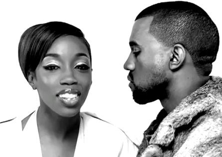
Some of the studio shots we included are from 'American Boy' by Estelle which show a male and female in the studio lip syncing the song. This a key part of our video as it experiments with the different kind of shots we can get of the duo in the studio.
Some of the narrative shots we used are from 'Habits' by Tove Lo as they show a girl in the centre of the frame with changing backgrounds. It was important we put this in the steal-o-matic because it is something we are keen to use in our own video.
After we'd created this video, we asked our teacher to watch it and give us some feedback. Here is some of the constructive criticism she gave us:
- Edit the shots with quick cuts between them to allow them to fit the beat of the music
- Focus on how much percentage of the video will be performance and how much will be narrative
- Include lots of major close ups of the performers faces to contrast to wider and longer shots as this is a typical feature or music videos
- Experiment with interpretations of the lyrics, e.g. include shots of narrative performer throwing away phone to signify getting rid of restraints
R+P Post 18: Analysis of my track's lyrics and instrumentation
The lyrics for our track are important as they focus on breaking free from life's restraints, an issue which many people face and will be able to relate to.
They can be seen below.

For a lot of the lyrics, there are no literal interpretations of them as we just looked at the song as a whole to gain a rounded understanding, rather than focusing on specifics. Our video aims to amplify the lyrics and add new layers of meaning, such as when the lyrics state "I do everything you tell me not to do", the video will show the girl running away from her boyfriend as we are representing the constraints of a relationship. However, we will illustrate some lyrics literally and looked at some key words and phrases that we thought would look good with a clear visual interpretation. The main one we will play around with is "I still got sugar". The girl in the studio will have a close up of her lips syncing this phrase and then it will cut straight to the girl in the narrative playing with gum/sweets in her mouth in a playful and teasing manner. This literal interpretation draws a parallel between the girl in the studio and the girl in the narrative to show that the song the girl in the studio is signing, directly compares to the narrative aspects, as if the narrative is acting out the song and it's meaning. Along with this, the studio set up will be pink for this section of the song with pink lollipops scattered across the floor.

On the right is an idea of how the close up of the girl playing with sweets in the narrative might look.
They can be seen below.
For a lot of the lyrics, there are no literal interpretations of them as we just looked at the song as a whole to gain a rounded understanding, rather than focusing on specifics. Our video aims to amplify the lyrics and add new layers of meaning, such as when the lyrics state "I do everything you tell me not to do", the video will show the girl running away from her boyfriend as we are representing the constraints of a relationship. However, we will illustrate some lyrics literally and looked at some key words and phrases that we thought would look good with a clear visual interpretation. The main one we will play around with is "I still got sugar". The girl in the studio will have a close up of her lips syncing this phrase and then it will cut straight to the girl in the narrative playing with gum/sweets in her mouth in a playful and teasing manner. This literal interpretation draws a parallel between the girl in the studio and the girl in the narrative to show that the song the girl in the studio is signing, directly compares to the narrative aspects, as if the narrative is acting out the song and it's meaning. Along with this, the studio set up will be pink for this section of the song with pink lollipops scattered across the floor.

On the right is an idea of how the close up of the girl playing with sweets in the narrative might look.
R+P Post 17: My chosen track
The track we have chosen for our music video is called 'Best Be Believing' by AlunaGeorge.
We chose it for a variety of positive reasons such as:
- It is upbeat and has a tune that we all found very catchy, meaning it is a song that will stay in people's minds
- The lyrics are relatable as they talk about transgressing barriers that might be restricting and oppressive
- The track, despite being sung by just one female, was created by a duo, allowing for us to use two main people in our studio shots which is more interesting to watch
However, there are also some negative aspects that we had to take into account:
- The track lasts longer then three minutes meaning we have to cut it down at an appropriate point which may prove quite difficult to do
- The instrumental is quite choppy at points and we want to edit to the beat so this may also be tricky to perfect
Along with choosing this track, we had to make sure that we weren't breaking any copyright rules, so we emailed the record label asking for permission to use the song for education, non-profit purposes.
 |
| The email we sent them for Eleanor's account |
Friday, 7 October 2016
R+P Post 16: My band or artist
Our duo is made up of one girl; Mira (aged 21) and Jack (aged 23) but together they are called MiraJax. This name was influenced by the existing duo who created the song we are using and they are called AlunaGeorge. The use of a girls name followed by a boys name allows for a simple artist name that recognises both people involved. I created collages showing the groups influences and inspiration for both Mira and Jack, these can be seen below.
 |
| Mira - colourful make up and clothes, wears brands such as Moschino, wears lots of jewellery, experiments with hairstyles, takes inspiration from Rihanna's outgoing nature and attitude |
 |
| Jack - passion for djing, wears brands such as Stone Island and YSL, takes inspiration from artists such as A$AP Rocky and Tyga who promote confidence and style |
When thinking about each artist in our duo, Richard Dyer's 'star' theory helped us realise why we created each individual as we did. He suggests that stars represent certain attitudes that audiences can relate to which allows for them to create a star persona. Both Mira and Jack were brought up in London suburbs and haven't led easy lives. This is what has shaped them to be the people they are today and the attitudes they have, allowing our target audience who may have also faced difficulties to look up to them and feel inspired.
R+P Post 15: My record label
The record label we decided on is 'Island Records' as it best suits our artist. Due to the UK branch, the record label will be able to guide our artist in the right direction in terms of music that's trending in the UK.
 These are a few of the artists currently signed to Island Records and as can be seen, Disclosure are included. They are 'an English electronic music duo' as described by Wikipedia, which perfectly matches our duo and so the fact that they are signed by this record label and are very successful gives us hope that the label will be able to make our duo a success too.
 On the official Island Records website, their home page displays lots of news about each artist and what recent achievements they have made. This shows that the label care a lot about each of their signed artists and want them to do the best that they can. This support given makes us feel confident that our duo will receive positive feedback and input from the label to push them forwards in their music career.

 On the official Island Records website, their home page displays lots of news about each artist and what recent achievements they have made. This shows that the label care a lot about each of their signed artists and want them to do the best that they can. This support given makes us feel confident that our duo will receive positive feedback and input from the label to push them forwards in their music career.
R+P Post 14: My target audience
After looking into different target audiences, we were able to figure out who our core/primary, secondary and tertiary audiences are for our particular song choice and music video.
Core Audience
Students aged 16-25, mainly females
Due to the age of our artists in the duo (21 and 23), they will appeal to a younger audience made up of teenagers and students. This is because of their urban image, wearing brands that many students will have heard of and are likely to wear themselves. Also, the track that we are making a music video to talks about breaking free from restraints in the lyrics and so teenagers who are rebelling from life's commitments and hold-backs would be able to relate to the music. To the right is one of our friends, Emily (17), who we spoke to about our music video project and she told us that she personally really enjoys our song track and that she can relate to our video ideas.
 Our song has strong instrumentals and a catchy electronic beat which would appeal to fans of the snythpop genre. Along with this, the rest of the songs on our album will be based around this genre, possible playing around with different electronic beats and some may not include lyrics. Our secondary audience could be made up of both younger and older people because snythpop appeals to all ages and originated in the 80s so is likely to have fans that have supported the genre since then. To the left is Ollie (17), he like the idea of our artists but is more compelled by the snythpop music than anything else.
Core Audience
Students aged 16-25, mainly females
 |
Secondary Audience
Fans of the synthpop and electronic genre
 Our song has strong instrumentals and a catchy electronic beat which would appeal to fans of the snythpop genre. Along with this, the rest of the songs on our album will be based around this genre, possible playing around with different electronic beats and some may not include lyrics. Our secondary audience could be made up of both younger and older people because snythpop appeals to all ages and originated in the 80s so is likely to have fans that have supported the genre since then. To the left is Ollie (17), he like the idea of our artists but is more compelled by the snythpop music than anything else.
 Sunday, 2 October 2016
R+P Post 13: Influences and inspiration from art, fashion and culture
 |
| Ashley William's collection |
UK culture plays a huge part in our influences because one of the main things we want to achieve is a real UK image for our artist. Their British, more specifically; London, roots have to be really obvious in order for us to achieve this and so one of the aspects we focused on is London Fashion Week, something which I'm personally really interested in.
An element of London Fashion Week that really stood out to me was what BBC called 'The Kids are alright'. An article was written about the 'kids' style, with images showing the gritty, slightly punk look. Our artist is all about being outgoing, wild and reckless and this is in part represented through her choice of clothes, as will be seen in our music video.
Therefore, to successfully present these qualities, we looked to London Fashion Week to take inspiration from the bold outfits that British kids wear.
 |
| Article published on the BBC website |
Therefore, to successfully present these qualities, we looked to London Fashion Week to take inspiration from the bold outfits that British kids wear.
 |
| We will take inspiration from the bright colours |
R+P Post 12: Artists/bands that have influenced my ideas
We looked to other artists for inspiration in order to find the particular qualities that we want our artist to have. It is important to us that our duo represent self worth and can be a role models for people who listen to their music.
Jorja Smith is someone who oozes a sense of self love and she stands up for what she believes is right, focusing on current issues such as oppressive policing which is referenced in her song 'Blue Lights'. She is new on the UK music scene which makes her more of an influence as our duo are also new and trying to appeal to as many people as possible.

 A lot of her music gets released on SoundCloud which is a platform that many students use to listen to tracks that they like and this is something we liked about her because it shows that she understands youth, which is also reflected in her music. We want our artist to have the same relatability as Jorja Smith, and as they share the same target audience, we think it would be a good idea to release their songs on SoundCloud as well and have tracks that focus on real issues.

Moreover, Jorja Smith has a good image about her. She comes across as a very down to earth girl and shows an interest in UK fashion trends, something that is important for our artist. She wears clothes such as denim jackets and crop tops, and accessorises with big hoop earrings.
For the male in our duo, we looked at Professor Green as he is a British artist who has a similar look to what we want and he also releases music of the electronica genre. Along with this, he has faced hardships in her personal life such as being involved in fights, yet he still manages to rise above this and show his self worth. This is essential because we want our duo to be positive representation of youth and allow others to aspire to be like them.
Jorja Smith is someone who oozes a sense of self love and she stands up for what she believes is right, focusing on current issues such as oppressive policing which is referenced in her song 'Blue Lights'. She is new on the UK music scene which makes her more of an influence as our duo are also new and trying to appeal to as many people as possible.

 A lot of her music gets released on SoundCloud which is a platform that many students use to listen to tracks that they like and this is something we liked about her because it shows that she understands youth, which is also reflected in her music. We want our artist to have the same relatability as Jorja Smith, and as they share the same target audience, we think it would be a good idea to release their songs on SoundCloud as well and have tracks that focus on real issues.
Moreover, Jorja Smith has a good image about her. She comes across as a very down to earth girl and shows an interest in UK fashion trends, something that is important for our artist. She wears clothes such as denim jackets and crop tops, and accessorises with big hoop earrings.
 |
| Wearing a bomber jacket - reference for fashion |
 |
| This song talks about some of the issues he faces, particularly rising above the stuff that is said about him |
R+P Post 11: Artist websites that have inspired and influenced my ideas
Artist websites are an essential part of marketing for the artist as they serve as the hub of information. They contain links to other platforms such as the artist's social media accounts and links to their music or store. Websites allow for cross media convergence as radio broadcasts can be accessed as well as articles that have been written.
 A website I particularly liked is Wilkinson's website. He is a dj known especially for his drum and bass music and he has toured all over the world.
His website appealed to me because it is easy and simple to navigate which means that people viewing it won't feel frustrated when trying to gain quick knowledge of tour dates for example.
The bar at the top has links to all the information that a fan would want to know and these links then take you down the home page to where that certain information is.
 His website uses a range of colour to draw his audience in, so despite the fact that it is a simple website, it still remains effective and interesting. His links allow you to like and tweet them so that he can gain popularity through social media which is very important as many people now have social media accounts and it's a quick way to get his music out.
Subscribe to:
Comments (Atom)